This page will be a comparison of Adobe’s Camera Calibration profiles.
With the release of Lightroom 5.4, Adobe added their Fujifilm-endorsed Camera Calibration Profiles for the Film Simulation Modes. This page will be a quick, mostly visual analysis of how these profiles affect your images. I’ve run into problems with Adobe’s reverse-engineered profiles in the past where they’ve struggled with subtleties so I was interested to see how they did with Fujifilm’s profiles.
Profiles
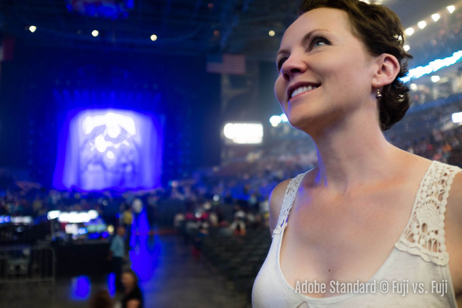
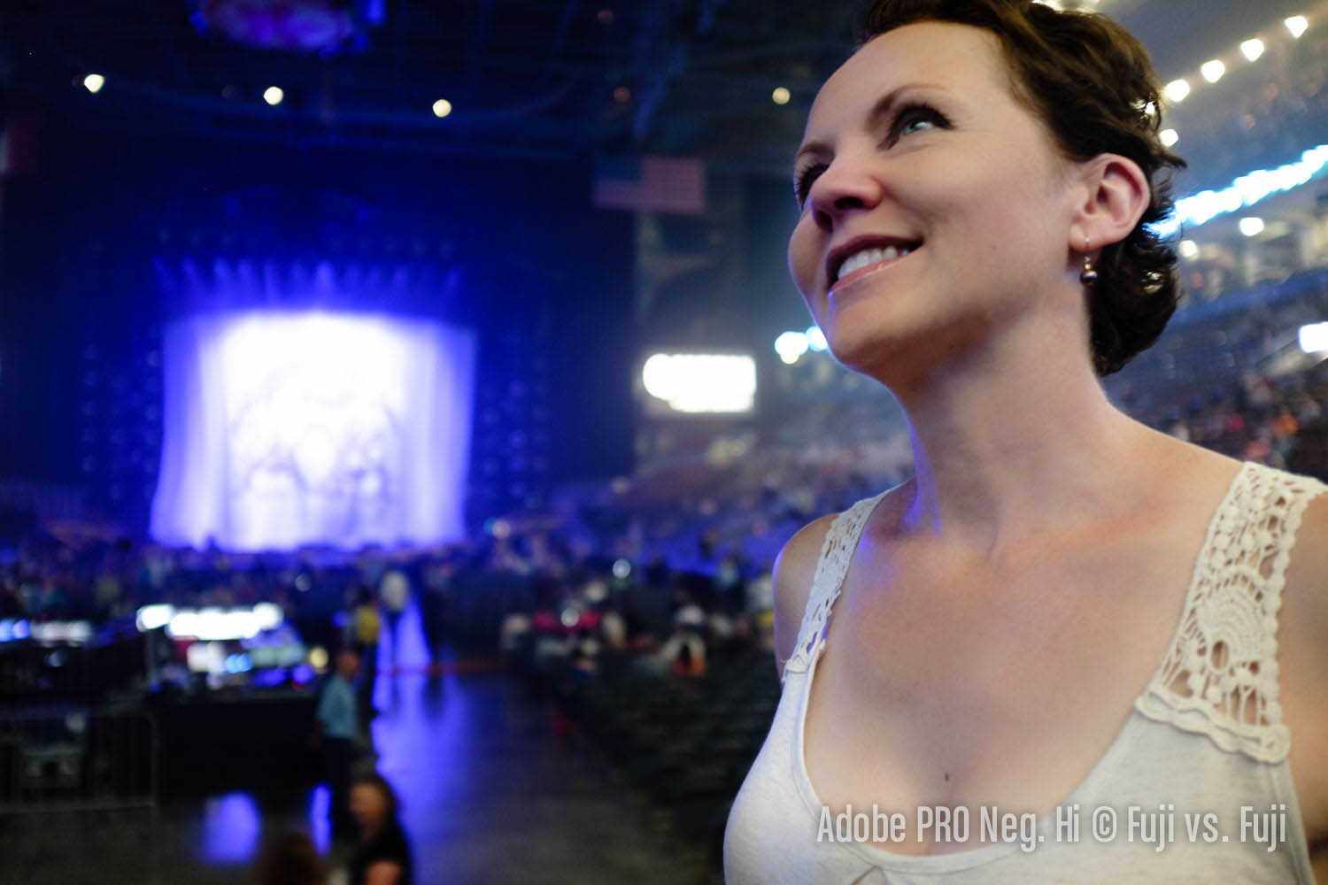
Here’s a quick comparison that should be of interest to RAF shooters, particularly those that shoot concerts. My wife and I attended Queen’s latest show. I snapped the image above with my X100S,1 and while not technically great, it does illustrate camera profile rendering very nicely.


Analysis
Check out the stage in the background. In Adobe Standard—the default profile used by Lightroom and Adobe Camera Raw—the brightly-lit and colourful lights of the stage are rendered horribly. It reminds me of when Todd Owyoung from I Shoot Shows compared Adobe’s profiles with Nikon’s as rendered in Capture NX. The difference here is Adobe’s own take on Fuji’s Pro Neg. Hi looks great without any further adjustments, and bizarrely, is vastly superior to their own Standard profile. The good news is it’s looking more and more like Adobe have gotten much closer with Fuji’s profiles than they had with many of Nikon’s.
I had chosen Pro Neg Hi for its superior skintone rendering, but as a matter of fact, Adobe’s PROVIA renders the stage area even better. For the curious, here are crops of the remaining profiles.


As mentioned, PROVIA looks great. It holds more detail in the highlights which is to be expected given Pro Neg. Hi’s increased contrast. VELVIA is definitely more saturated, but it doesn’t looks too great below the stage just right of centre where the lights are reflecting off the floor. ASTIA moves almost entirely away from violet an into blue. That same area that looks kinda bad in Velvia is also not great here. And finally Pro Neg. Std looks as we’d expect, a less contrasty version of Pro Neg. Hi.
- The X100S that was a “DSLR” according to one security member who almost had it confiscated after I explicitly called guest services to confirm I could bring my camera. Fortunately another nice security member let it slide despite also not really understanding what a mirrorless camera is. ↩
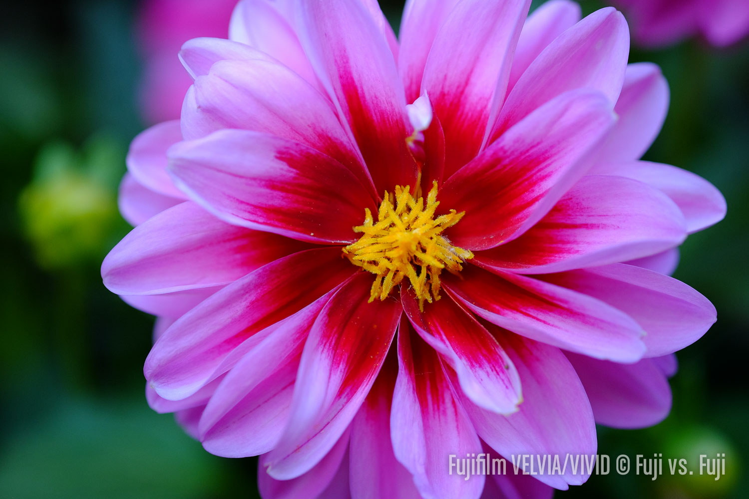
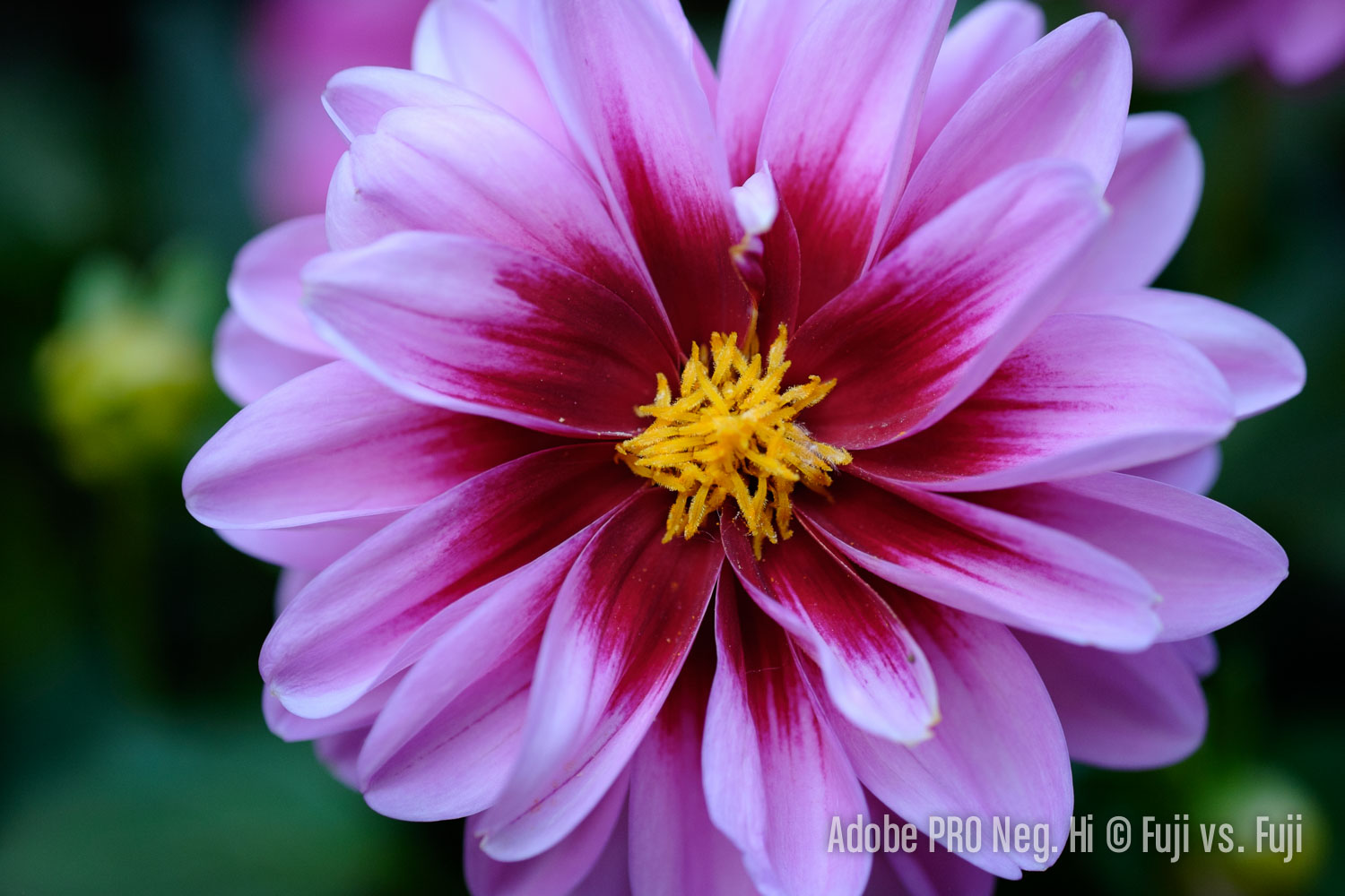
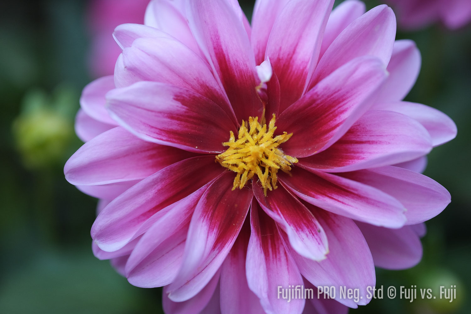
Flower close-up
This set of images has received no processing at all outside of some mild sharpening.
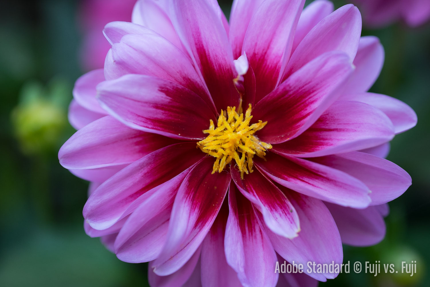


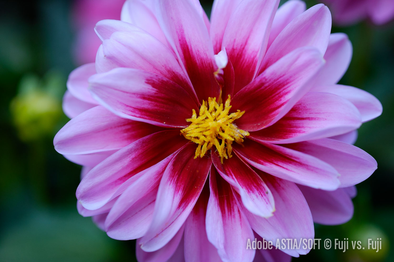


Analysis
This is one instance where PROVIA is my preferred rendering. Adobe’s Standard is pretty flat by default, but that’s sort of the point. Adobe’s VELVIA is hyper saturated, but remarkably well controlled as far as blown channels are concerned. Adobe’s ASTIA and Pro Neg. Hi both appear significantly cooler than the other profiles. And finally, Pro Neg. Std is even less contrasty than Adobe Standard. Pro Neg. Std might be the best base rendering for when you’re looking to extract maximum detail from your images.
Adobe vs. Fujifilm in-camera rendering
This gallery shows how Adobe’s profiles compared to the colour produced by the in-camera Film Simulation Modes. Click to enlarge and use yuor arrow keys to quickly cycle through the images for easy comparison.


Analysis
I think the Adobe’s take on Fujifilm’s profiles can be summed up in one word; conservative. They’re all just a little bit more tame, a little less vivid, less saturated. Fuji’s colours almost have a glow about them, and are impossibly saturated while holding on to virtually all detail. Fujifilm’s VIVID is an excellent example. You might find the colours over the top, but the amount of detail present with colours this saturated is really quite impressive. This isn't the case all the time, however. Had this flower been in sunlight we’d probably be looking at blown out colour channels. Fujifilm’s ASTIA and PRO Neg. Hi don’t take on quite as cool a white balance as Adobe’s version, but it’s still there.
Cliff, sky, and clouds
In this set of images, I kept processing of the sky minimal with the exception of reducing exposure so the detail is visible. Otherwise, all processing is identical between the images. It’s a fairly extreme example of exposing to the right in order to hold as much detail in the cliff as possible without blowing out the sky. This image is treading very close to overexposure in the sky.


Analysis
Overall, the Adobe-emulated Fujifilm profiles have more saturation. The more delicate transitions from the clouds to the sky are handled very well in Adobe Standard, but these is some weirdness in the clouds with PROVIA. This is beyond nit-picky pixel peeping though. VELVIA blows out the clouds quite a bit more, and the subtle transition from the cyan area of the sky to the more magenta hues is drastically intensified. Contrast is also increased significantly. ASTIA looks like a toned down VELVIA while PRO Neg. Hi pushes the highlights and shadows similar to VELVIA without the saturation boost. And finally Adobe’s PRO Neg. Std looks closest to Adobe’s Standard profile.
Mountains, sky, and some green
Another landscape image, this time including a bit of green. This image also has a very wide dynamic range. I processed the photos moderately to bring out some shadow detail in the Adobe Standard profile to see how the Fujifilm profiles would then change it. Click to enlarge.


I’ll get the biggest beef I have out of the way first. It’s once again with the VELVIA profile. There is some unwelcome magenta being introduced around the clouds. This is too bad as the VELVIA profile is one I was hoping to use as a starting point for some landscape images. It adds a very unique look to the colour. With how it renders clouds, I’ll probably avoid it for the most part.
I prefer PROVIA to Adobe’s Standard profile in this image. The rock face of the foreground mountain has a less harsh look to it that’s also warmer. The blue of the sky is kept cooler too. I really appreciate how the warmth of the sunlit areas are maintained without muddying up the blue of the sky. I find the transitions from cloud to sky and back again on the left side of the image is a little nicer too.
ASTIA is VELVIA-light again, and thankfully without the magenta cast around the clouds. It offers a little more punch than PROVIA and the background mountains are quite a bit cooler.
PRO Neg. Hi is also a little cooler, and quite a bit more contrasty than Adobe Standard. I prefer the hue of the sky in the PRO Neg. Hi version as well. I could see the profile coming in handy for landscapes which is interesting considering it’s targeted at portraits. PRO Neg. Std appears warmer to my eye which is strange is my in camera comparisons have suggested it’s mostly a further desaturated version of PRO Neg. Hi.