This page has been retired. I confirmed with my own testing that Fuji’s Film Simulation Modes have evolved, and could still be.
The images on this page were all captured with an X-E1, so it will be of little interest to anyone not still shooting with one, and comparing currently generations of cameras with these earlier images wouldn’t be of much value.
This article will compare Fujifilm’s Film Simulation Modes along with histograms so we can see what’s happening with our eyes, and on a slightly more technical level.
I fully acknowledge this comparison has been done to death, but I find most cram a bunch of little thumbnails together and don't really give you a sense of what’s being done in camera.
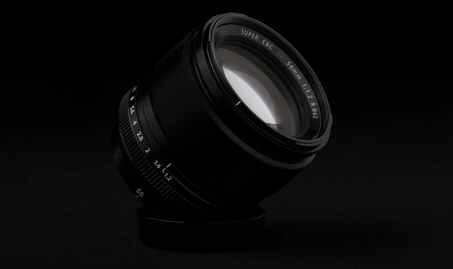
All images were shot with the same white balance and all other settings at the default. Certain images will feature all modes, while others will forego the black & white modes. Sepia will be ignored outright. I used an X-E1 with the 35mm ƒ/1.4 for my testing as I wanted a 16MP X-Trans sensor and the 35mm ƒ/1.4’s edge to edge quality is uncanny.
NOTE: My recent head to head comparison between the colours of the X-E1 and X-E2 suggest that your camera might have almost as much to do with how Film Simulations Modes are rendered and the mode you’ve chosen. These tests were done with an X-E1 and Fuji has evolved the Film Simulations since then. Please keep that in mind.
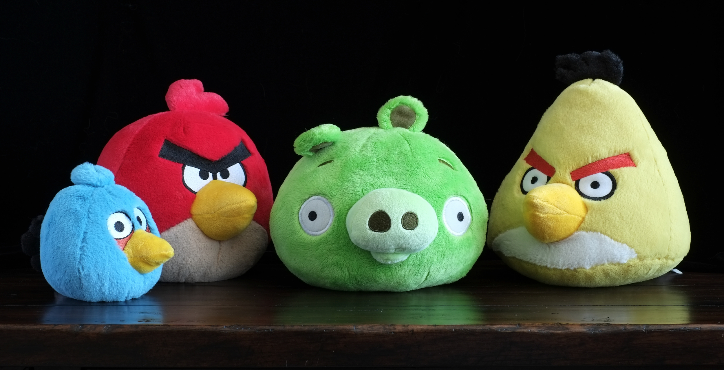
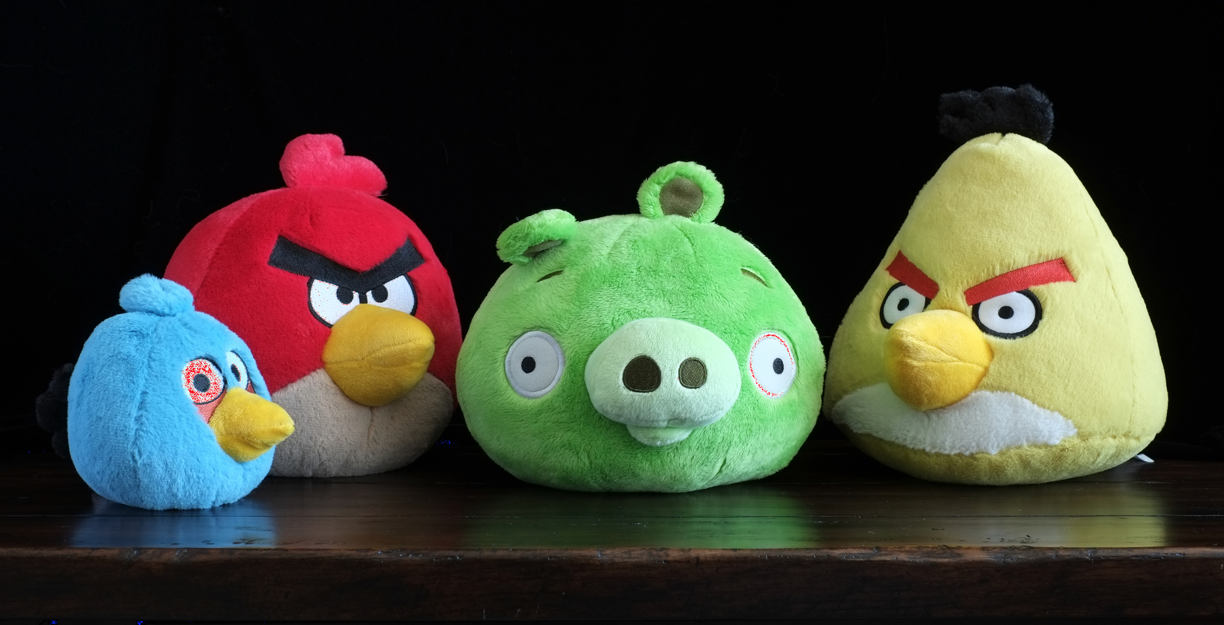
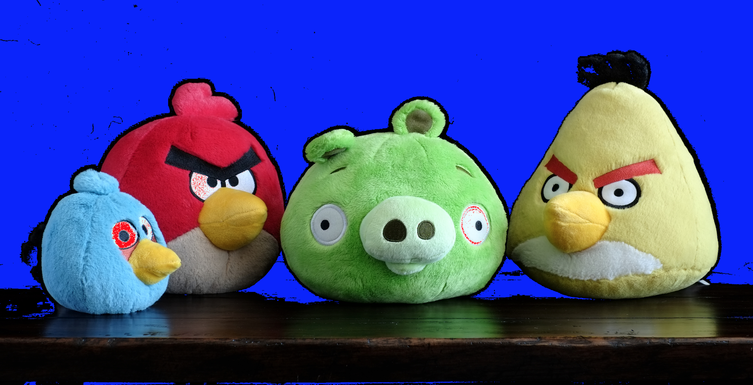
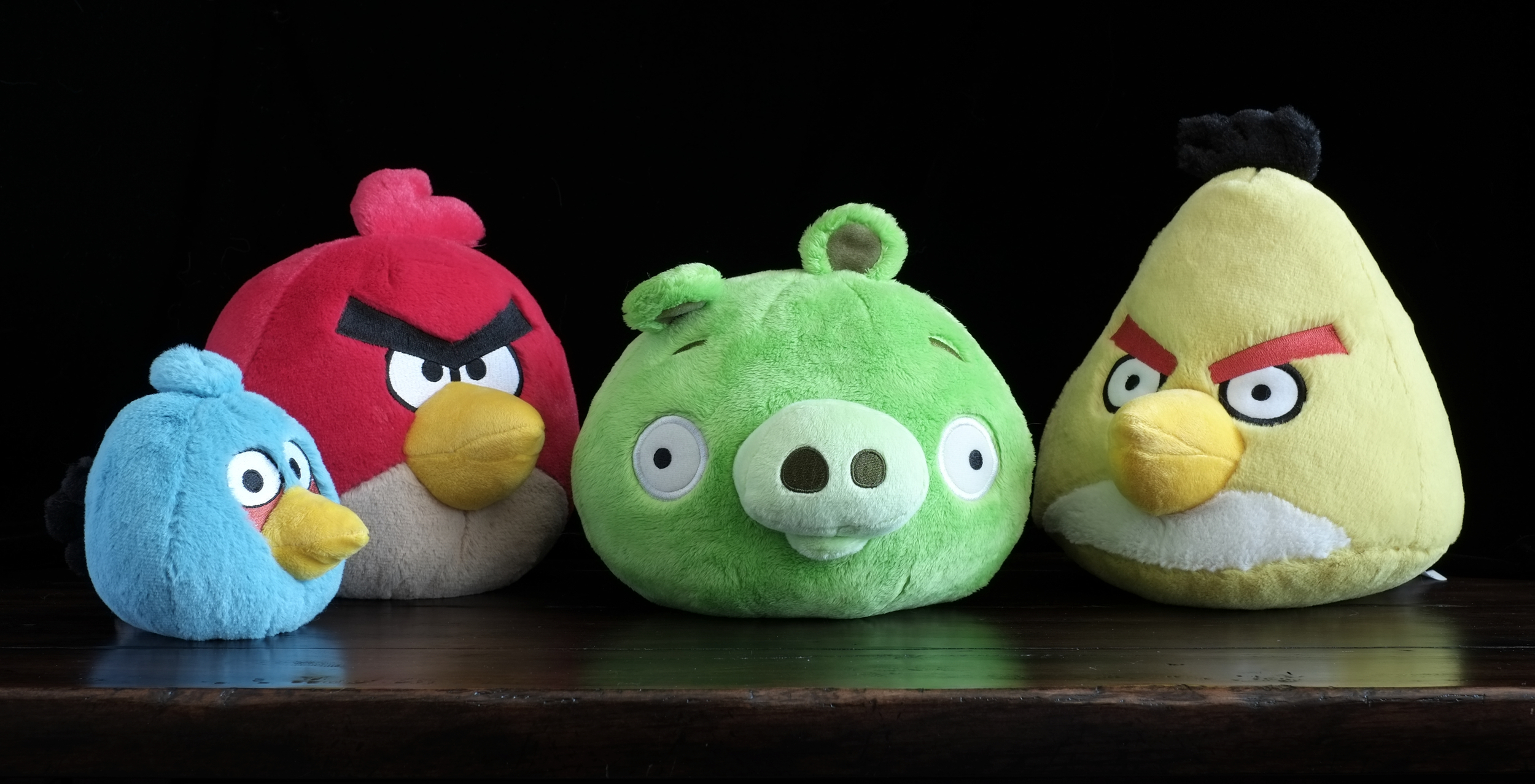
Angry Birds
I initially used these little guys as a test subject for my 60mm ƒ/2.4 Macro vs. 56mm ƒ/1.2 article, but it quickly occurred to me that their colours would make an excellent Film Simulation Mode comparison subject. I do still intend to add landscape, cityscape and portrait comparisons.
I should also note that I don’t remember my analysis exactly from the previous bookcase test and I’m doing my best to not refer to it at in an effort to see ifI come to the same conclusions.
Click to enlarge and use the arrow keys to cycle through the images.


Analysis
Provia/Standard
Fujifilm Provia Film Simulation Mode once again lives up to its name. The colours appear very neutral, and exactly as I remember the scene looking. Colours are extremely true to life, if a little plain.
At first glance the histogram appears a little heavily weighted to the left, but if you look closely on the RGB ramp, you'll notice a tiny sliver of white, just before that large spike in the deep shadows. Turning on Shadow and Highlight clipping in Lightroom confirms this. Almost no shadows have been clipped and just a bit more of the highlights have been. Overall it is a well balanced exposure as far as the in-camera processing is concerned. I didn’t make adjustments to the exposure and instead let the camera choose the shutter speed based on my Aperture and ISO.
This example confirms my sentiment that Provia is great for documentary photography, but if you’re looking to add some artistic flair, it may not be the best choice, unless you’re looking for a neutral starting point. For me, I’d invariably what to push things a little more in post.
The full image is below along with an screen capture of clipping visible.


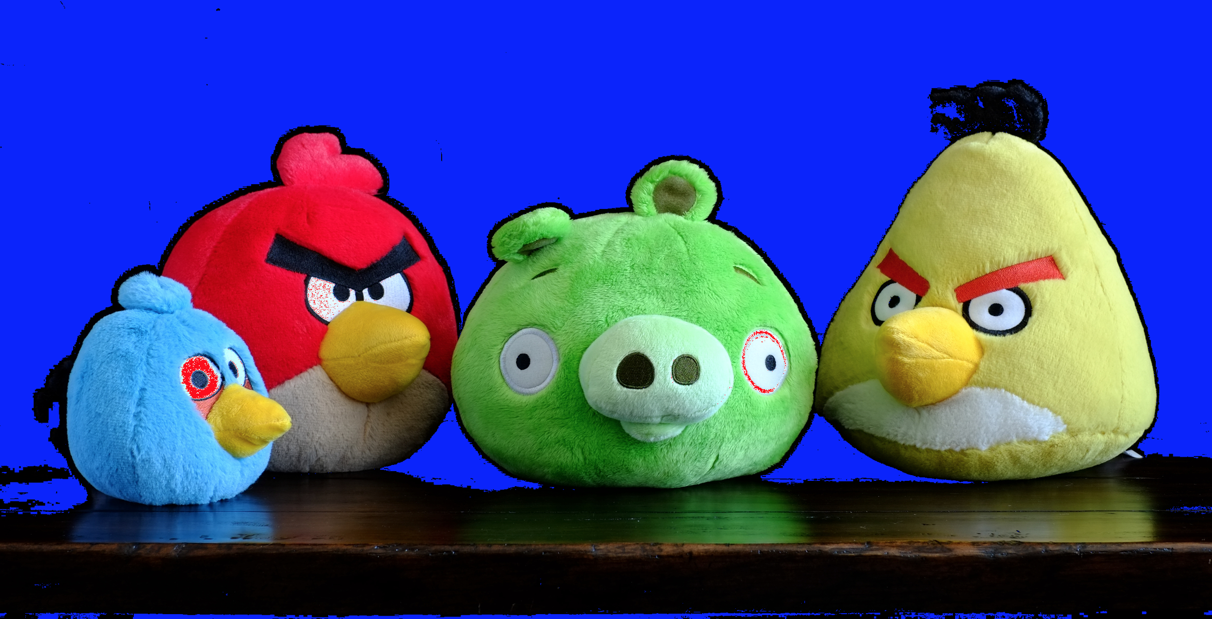
Velvia/Vivid
Vivid is right! All colours are clearly pumped up when captures in the Velvia Film Simulation. I’m quite curious how this stacks up against the venerable film version of Velvia as I find that in many cases, the Film Simulation pushes things too much or too far away from the actual colour. In this case, you can see the difference especially in the blue bird as it’s colour has moved towards purple. Sometimes this might be a nice effect, other times I’ve found skies take on a weirdly unnatural hue. That’s personal preference though.
The red bird has been pushed almost to the point of detail loss. It’s still there, but if you changed the Colour setting in the Quick menu to anything higher than zero, detail in the reds is sure to be lost.
Greens are more saturated and pushed into nuclear territory, but detail is held very well. This stands to reason given Velvia’s typical landscape application, but for me, the greens are often pushed to far. I would likely shoot with Colour set to -1 if I was shooting JPEG. On the landscape note, the intensified reds can partially be chalked up to autumn colours. Red is often a more rare colour with yellows and oranges dominating.
The yellow bird is the one I like the most as far as the shift from Provia is concerned, in addition to the beaks. Although to my eye, it appears to have moved towards green a little.
Now let’s have a look a those blacks. Wow. Velvia is shameless about the clipping. Shadow detail is definitely lost here. The top of the yellow bird would be lost completely if it wasn’t for a bit of remaining highlight. The lesson here is if you want to hold detail in the shadows, look elsewhere.


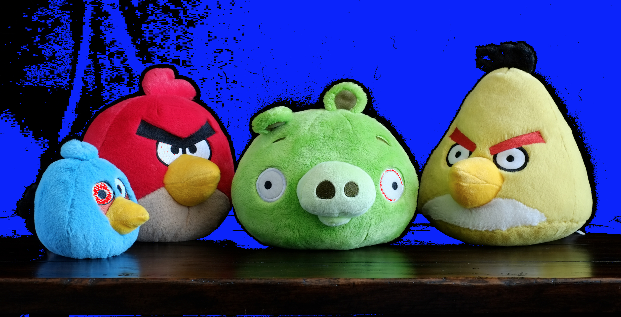
Astia/Soft
I understand Fujifilm’s description of “Soft” much more in this example. It still doesn’t quite line up in terms of colour when comparing it to Provia as it is more saturated across the board, but there is a more subdued feel about the contrast in the colours, despite way more of the blacks being clipped.
I noticed it first in the yellow bird. It’s definitely been flattened out a little with less difference between the shadow and highlight areas.
The red and blue birds get the largest of the saturation bumps, although neither are as extreme as what’s seen in Velvia.
The green in the pig has be shifted quite drastically towards yellow. This makes me reevaluate the notion that Astia would be good for landscapes. It’s definitely still usable, but if you want your greens, green, you’ll want a different Film Simulation Mode.
Back to the clipping again, while not quite as pronounced as in Velvia, it’s far more than found in Provia. Care will need to be taken with Astia if shadow detail is important.


PRO Neg. Hi
The clipping continues. Once again we have major black clipping that’s almost as strong as Velvia. With that comes a reduction in colour saturation, and colour luminance when compared to Provia. This makes an awful lot of sense since for a Film Simulation targeted at rendering pleasing skin tones. Slight overexposure is often desired, but blown colour channels can quickly make skin tones look terrible.
Where Astia softens colour contrast, PRO Neg. Hi appears to intensify it slightly, but this could simply be an overall change in contrast.
The greens once again are moved into yellow territory, although nowhere near as much as with Astia. I’m a little surprised there isn’t a more noticeable reduction in yellow saturation.
And finally, the blues appear to move ever so slightly towards cyan/green in addition to the saturation drop.

PRO Neg. Std.
Last, but not least, PRO Neg. Std. Unbelievably, PRO Neg. Std. actually crushes the blacks slightly more than Provia does. Highlights are also slightly more blown. This is surprising to me as it’s contrary to everything my eyes have told me up until now about PRO Neg. Std., which is that it softens shadows considerably.
I was wondering if there is simply a limit to how black the blacks are that this Film Simulation will work to soften, but I think the real answer is it works strictly on colour saturation, and full black isn’t altered. Take a look at the inside of the pig’s ear. The slightly more shadowed area appears very similar, if not identical between PRO Neg. Std and Provia.
The saturation of all colours is reduced further from PRO Neg. Hi. By default, this is the Film Simulation Mode with the least saturated colours.
The blues appear to move just a little bit further towards cyan/green again. Reds away from orange and slightly towards magenta. Yellows a greens appear to only soften more with not much shift in hue.

Conclusion
That’s it for this round. I think next on the agenda will be to compare Adobe’s versions of the Film Simulation Modes to the in camera rendering. What I’ve seen to far is promising, but there were subtle differences.
Bookcase
This is the first image used to compare and contrast the colour Film Simulation Modes only since I didn’t find the black & white modes provided much information.
Click to enlarge and use the arrow keys to cycle images.


Analysis
Provia/Standard
Provia is FUJIFILM’s “Standard” Film Simulation. They describe is as “ideal for a wide range of subjects.” “Safe” could be another good way to describe it. Without any tweaks to the Colour, Shadow Tone, or Highlight Tone, the histogram in this example is fairly evenly spread out.
There are some areas that are fully black, but the camera doesn’t plug up too much of the shadow areas. Highlights are also rendered appropriately without too much getting blow out.
No colour channels are blown out either. Detail is nicely held. There was some warm artificial light which would account for the red channel rampng up to the right. I’m not quite sure what to make of the blue channel pushing further into the showdows. It will be interesting to see how these film modes perform with some vibrant flowers in sunlight. This scene is rendered pretty close to how you’d see it if you were standing here.
True to life, but not terribly interesting. I find with almost everything I shoot I want to move away from Provia.

FUJIFILM’s Provia/Standard Film Simulation Mode

Velvia/Vivid
We go to the other end of the spectrum with Velvia. FUJIFILM describe it as “Vibrant reproduction, ideal for landscape and nature.” It certainly is vibrant. The histogram gets crushed up against either side significantly more than with Provia.
Colours are significantly more saturated as well. Have a look at the books in the top left of the image; the yellows are crazy vibrant, while the reds are pushed slightly towards orange. I’m surprised at how little change there is in the green of Hyrule Historia book.
Swinging over to the opposite side of the image, the “You, Staying Young” book (purchased when Dr. Oz wasn’t a circus) is moved a little more towards yellow and a little bit “nuclear” like the yellow has And finally, the pink of the “Sex & the City” box set (don’t judge me!) has been pretty much blown out. Any fine detail that might be found in that colour would probably be lost.
The blues in this image have remained fairly pleasing to my eye. I’ve noticed in some outdoor images that blue skies can take on an unnatural hue at times depending on the atmosphere, time of day and direction I’m facing relative to the sun.
With the increase in contrast comes a pretty significant loss of detail in the shadows. In the Provia film mode, you can make out the back of the book case. With Velvia, forget it. The negative space around the objects gets plunged completely into darkness.
Overall it’s a decidedly more punchy film mode by default. Sometimes pushing the saturation this far can work, but I’d be tempted to knock the Colour down to -1 in the future when shooting with Velvia at times in order to maintain detail. I can easily bump it up a little further with the Vibrance slider in Lightroom if need be.
Was FUJIFILM able to replicate the look film photographers loved in Velvia film so much? I’ll let you be the judge.
FUJIFILM’s Velvia/Vibrant Film Simulation Mode

Astia/Soft
From here we move to Astia, Fuji’s “Soft” Film Simulation Mode with “Softer colour and contrast for a more subdued look.”
I’m not sure who wrote these descriptions, but the only way they could have missed the mark any worse is if this description was for Velvia. I suppose the description is valid when comparing Astia to Velvia, but next to Provia—Fuji’s self-described “Standard” film mode—Astia is anything but soft and subdued.
In fact, the histogram tells us and our eyes confirm it has deeper contrast, punchier blues and slightly more vibrant colours overall.
I was confused using this film mode for the first while because of the description. I figured it would render images suitable for Etsy or something like that, soft and perhaps warmer, which would be great. Instead, this might be an ideal film mode for landscape and nature. Astia compared to Velvia would be like comparing Nikon’s Landscape or D2X III Picture Modes with their Vivid Picture Mode. All too often Vivid would result in blown channels where Landscape and D2X III offered a nice colour and contrast boost.
When I’m shooting in Film Simulation Bracket mode as I often do, and only want colour options, Astia is one of those options along with the two PRO Neg Film Simulation Modes.
FUJIFILM’s Astia/Soft(?) Film Simulation Mode

PRO Neg. Hi
“Ideal for portrait (sic) with slightly enhanced contrast.” Save for the iffy grammar, Fuji nailed the decription for this mode. It’s excellent for skintones. So good it rivals Capture One in my humble opinion.
Despite its quirks, horrid UI, and crashtastic nature, Pro photogs cling to Capture One like it’s their last hit of a narcotic because of how beautifully it renders skintones. They’re right, of course.
My Dad is particularly challenging as a fairskinned ginger and after taking some shots of him in both RAF, and PRO Neg Hi JPEGs, I loaded them all up in Lightroom, a Capture One demo. Capture One obliterated Lightroom set to Adobe Standard with my Dad’s skin “out of the can” (with default settings), but I actually prefer the in-camera rendering of my Dad’s skin by my X-E2 set to PRO Neg. Hi. Perhaps I’ll write-up a comparison article on my personal site for this.
Of course with the excellent skintones afforded by PRO Neg. Hi comes all the limitations imposed by shooting JPEG, but lately that’s been a trade-off I’m happy to make thanks to Fuji’s Film Simulation Modes and bracketing.
Anyhow, back to the image. In comparing the PRO Neg. Hi image with the Provia image, the two are actually quite similar outside of a contrast boost to PRO Neg. Hi and a fairly substantial reduction in saturation to reds and magentas, with less of a reduction in oranges and yellows. This is exactly why this film mode makes my Dad’s redhead skin, and the skin of just about everyone I’ve shot, look so great.
The shadows appear just a little bit darker then Astia, but they’re not as deep as Velvia. The histograms confirm this.
PRO Neg. Hi is my current default and almost always on hand when bracketing film modes.
FUJIFILM PRO Neg. Hi Film Simulation Mode

PRO Neg. Std
Fuji got it right with the description here as well: “Ideal for portrait (sic) with soft gradations and skin tones.” Essentially it’s a low contrast version of its PRO Neg. Hi sibling. This would probably be your Etsy film mode if ever there was a need. I personally love the soft effect it gives for portraits. It’s very flattering.
If you look at the images, you see that it’s very similar to PRO Neg. Hi, but has significantly softer contrast in the shadows. The histogram confirms this. Details are held about the same as in Provia suggesting a similar tone curve. The histogram also shows softer highlights in PRO Neg. Std, but I’m not seeing it a great deal, if at all in the image. If I place an eyedropper on the neutral-ish white portion of the Assassin’s Creed game (lower left of the image), I see a very slight reduction of about 3 in each RGB value as compared to PRO Neg. Hi. It’s only a 1 or 2 point reduction from Provia. Perhaps it will be more obvious in another test image.
The reds, oranges, and magentas are toned back quite a bit further from PRO Neg. Hi and the yellow saturate is slightly reduced.
PRO Neg. Std is another film mode I often choose when bracketing.
FUJIFILM’s PRO Neg. Std Film Simulation Mode
Conclusion
That’s all for now! I hope the analysis and commentary has been of value to you. I plan to do a couple more images like a cityscape and landscape once things get green again so we can really analyze what’s happening in the blues and greens we’d most often shoot. Perhaps if my wife is willing to be a test subject I’ll do one for skin as well. We’ll see.