This is a detailed look at Adobe’s latest June 2015 release of Lightroom (6.1 / CC 2015.1), and how it compares with 5.7
A lot has been blogged and tweeted about Lightroom 6’s new features. Personally, I’ve avoided migrating my main catalogue to Lightroom 6,1 but with this last release of Lightroom, Adobe claims improvements to at least one aspect of XTrans processing, and promises collaboration with Fujifilm to “improve fine detail rendering and overall edge definition.”
While this suggests these improvements have yet to occur, I thought it might be interesting to have a close look at what, if any changes have been made to RAF demosaicing in Lightroom 6.1, particularly when it comes to extracting every last morsel of detail from our precious RAFs.
Technical Details
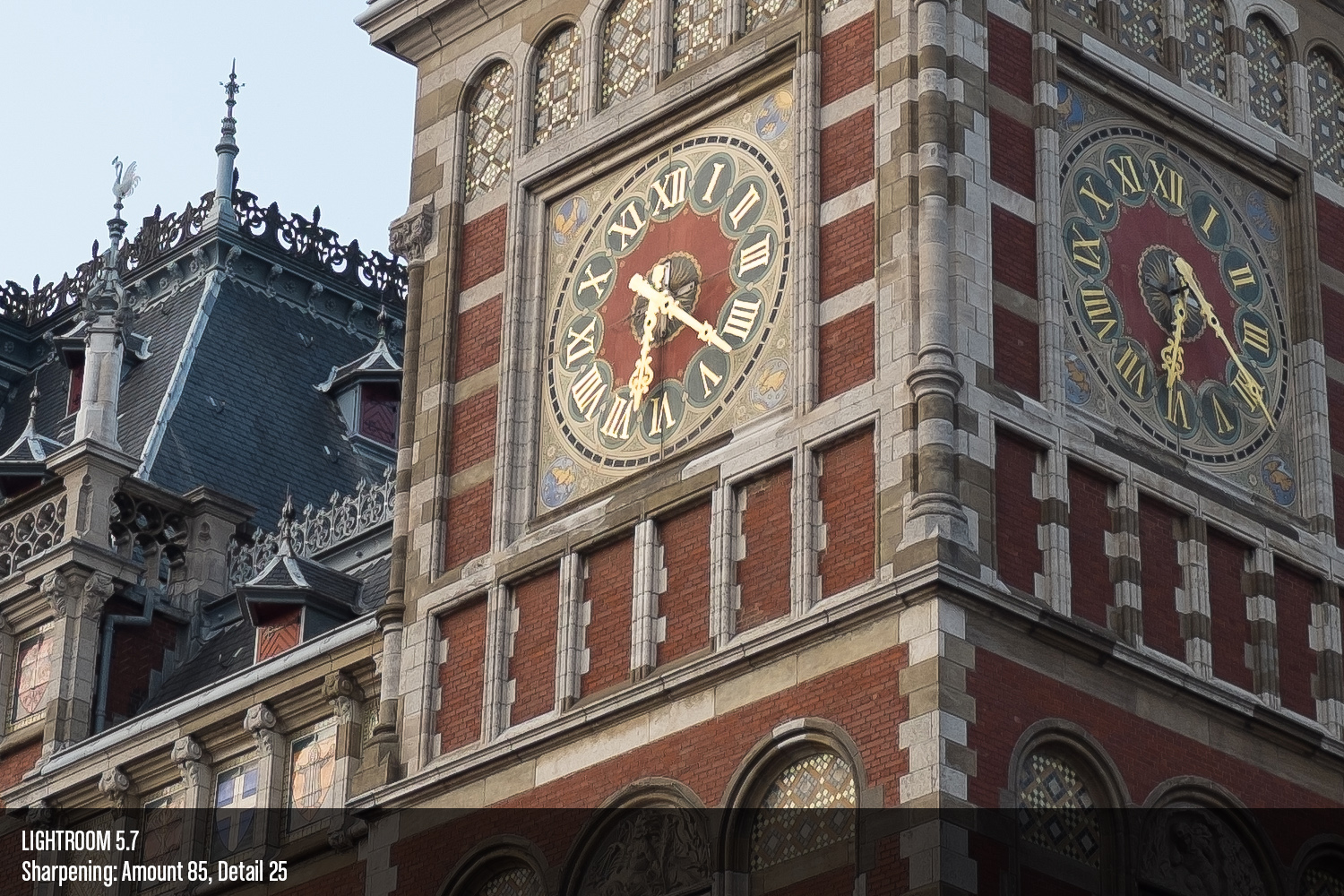
All these images were prepared with the same, reset settings, and using the 2012 Process and the Adobe Standard Profile.
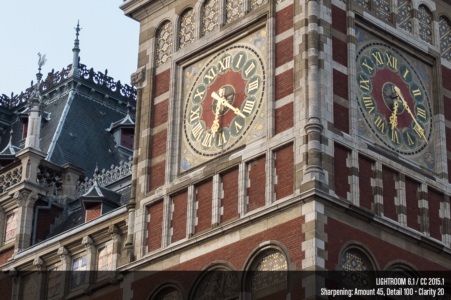
Fine Detail Architecture
Defaults
This image was captured in Amsterdam with my X100S. First, we’ll have a look at what, if any changes have been made to the defaults.


Perhaps of note is that despite it now being relatively common knowledge that Adobe Camera Raw performs better with RAFs when we make liberal use of the Detail slider, the defaults remain the same with both Amount and Detail set to 25.
Pay close attention to the brick, the roof tiles, and wrought iron detailing on the rooftop towards the left of the frame. Lightroom 6.1 already appears to be slightly more aggressive with its sharpening of fine detail, however it appears to handle the removal of aberrations much less well. I don’t think this is actually chromatic aberration, since it does not appear rather it could be a byproduct of Adobe trying to improve transitions from blue areas to other colours.
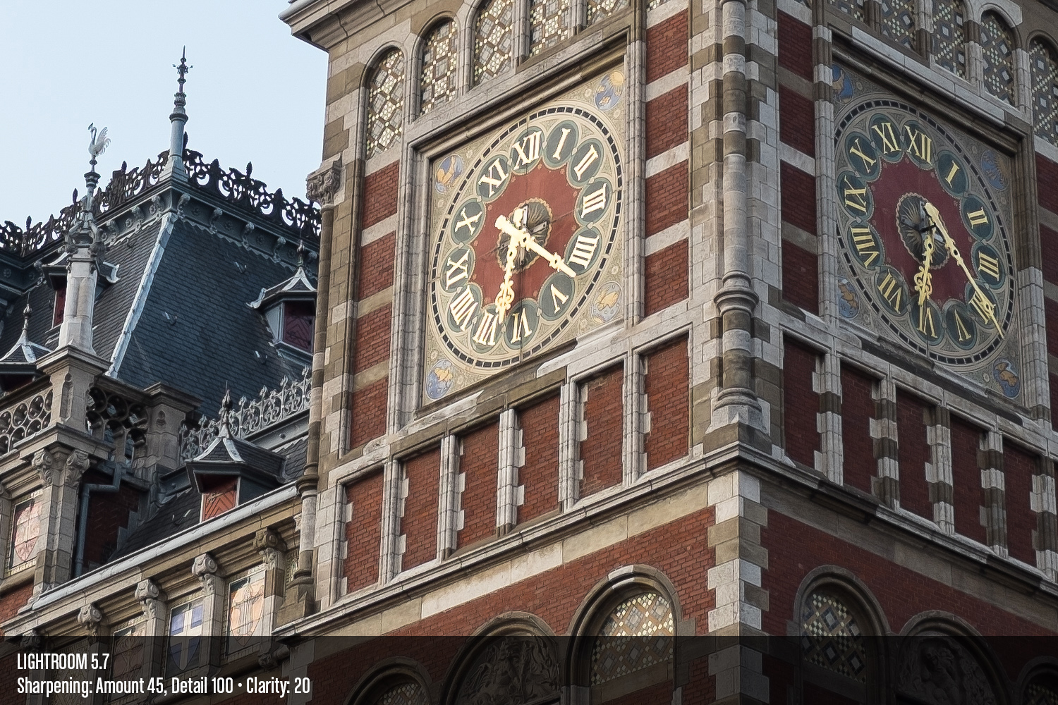
“Optimal” Amount
I’m making liberal use of the word “optimal” here. For one thing, what is optimal to me, and what’s optimal to you may be entirely different. For another, this method of sharpening (high amount, lower detail) is widely regarded as sub-optimal. This is really just the highest I would set the Amount slider, lest the image starts taking on “false detail” and getting too “crunchy,” as we’ll see below.

Not much more to note, really. Once again, the sharpening appears to be a little more aggressive. Check out the gold colour on the watch face though. Lightroom 6 is much more pleasing at it’s defaults.
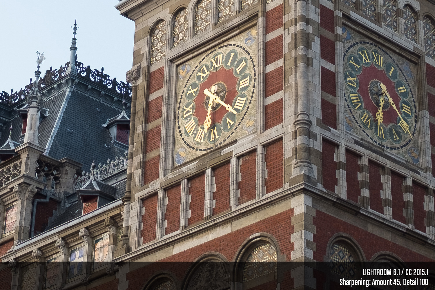
Over-Sharpened
Next we’ll look at what happens when the Amount slider is pushed too far to the right.


By this point, Lightroom is producing heaps of “false detail,” and garbling textures.
Set Detail to 11
As has been noted by at least one smart dude, Lightroom plays much nicer with X-Trans files when the Detail Slider becomes the priority. In this next series of images, I cranked Detail as far to the right as possible, then adjusted Amount, ensuring fine details are captured, transitions are still smooth, and without edge detail getting gross or halos becoming apparent. For this image, I found that setting was 45. This might be too high depending on the destination of your image and your output sharpening strategy, but for the sake of this comparison, we’ll roll with it.


I agree whole-heartedly–X-Trans files look much nicer with high Detail and lower Amount vs. the inverse, but I still advise that if you want to eke out the most detail from your RAFs, maintain smooth transitions in the gradients, avoid crunchy, aliased edges, and get super sharp capture sharping, there are better alternatives.
Anyhow, back to the images, not much different has changed with the Detail slider strategy either, so it appears that only the Amount slider has seen changes. The stronger Amount in Lightroom 6.1 does start to exhibit more weirdness in areas like the roman numerals on the left clock face. Nine through twelve are particularly bad.
Added Clarity
In this final comparison image with exact settings, we’ll see what happens when some Clarity is thrown into the mix.

Yup, it appears to behave identically.
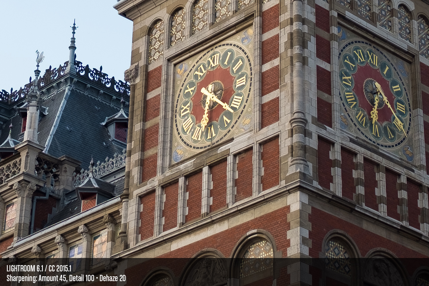
Dehaze
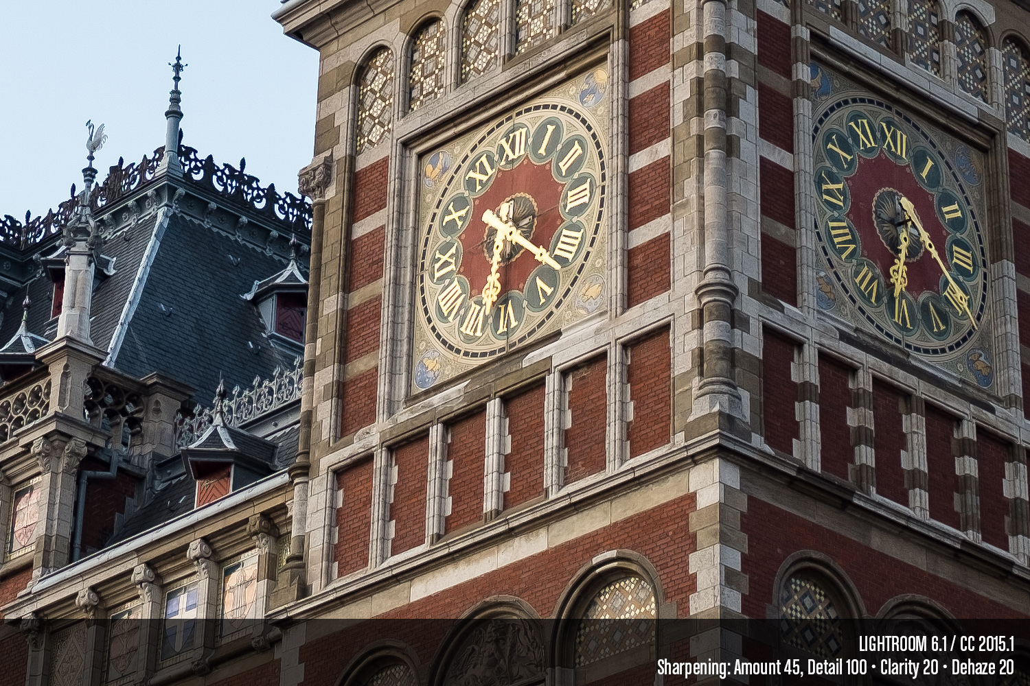
Finally, something new! In this comparison, I’ve “Dehazed” the image in Lightroom 6.1 to the tune of +20.

This is a nice feature, and really, “Dehaze” is the best name for it. It behaves differently than the options in the “Presence” panel. There is a slight contrast and saturation bump, but it’s not quite the same. I found I was able to achieve a similar effect by reducing the Exposure to -0.3, increasing the Highlights to +10, adding +10 Clarity for a total of 30, and +20 to Vibrance. I could get even closer with the Luminance panel, but really the point is the Dehaze slider makes it simpler. I can’t say it’s worth upgrading for, but it’s a nice to have.
Clarity vs. Dehaze
When I first yanked the Dehaze slider over the right, my first thought was that it was a little like Clarity. It is, and it isn’t. Here’s a direct comparison using the same image in Lightroom 6.1.

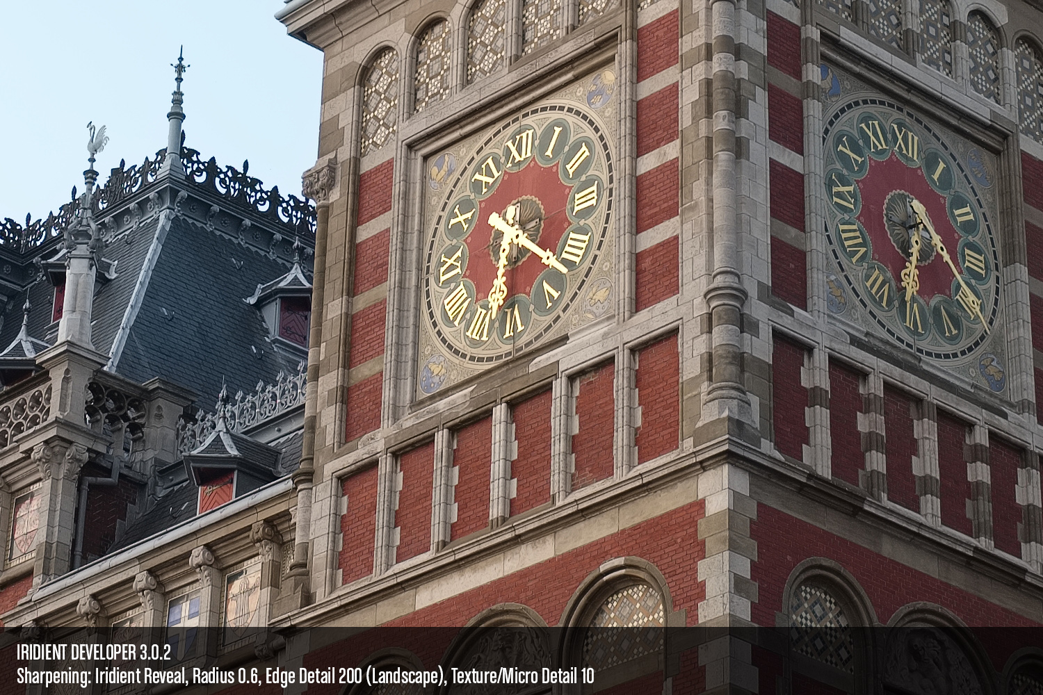
Iridient Developer will get you at least as much detail, cleaner edges, zero false detail, and smooth gradients. Just scrub back and forth across the left clock face and marvel at how clean the serifs on those roman numerals and the hands of the clock are.
Capture One
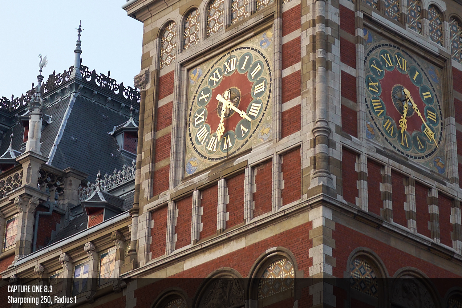
Capture One 8 is another good alternative. It can deliver images that are much cleaner than what Lightroom offers, and about the same level of detail. This first image will show “optimal” settings again, which means I essentially moved the Sharpening Amount slider to the right as far as I could without getting objectionable sharpening halos. Remember, we're sharpening for the screen in this case. Your files that have been sharpened for output should look much different.

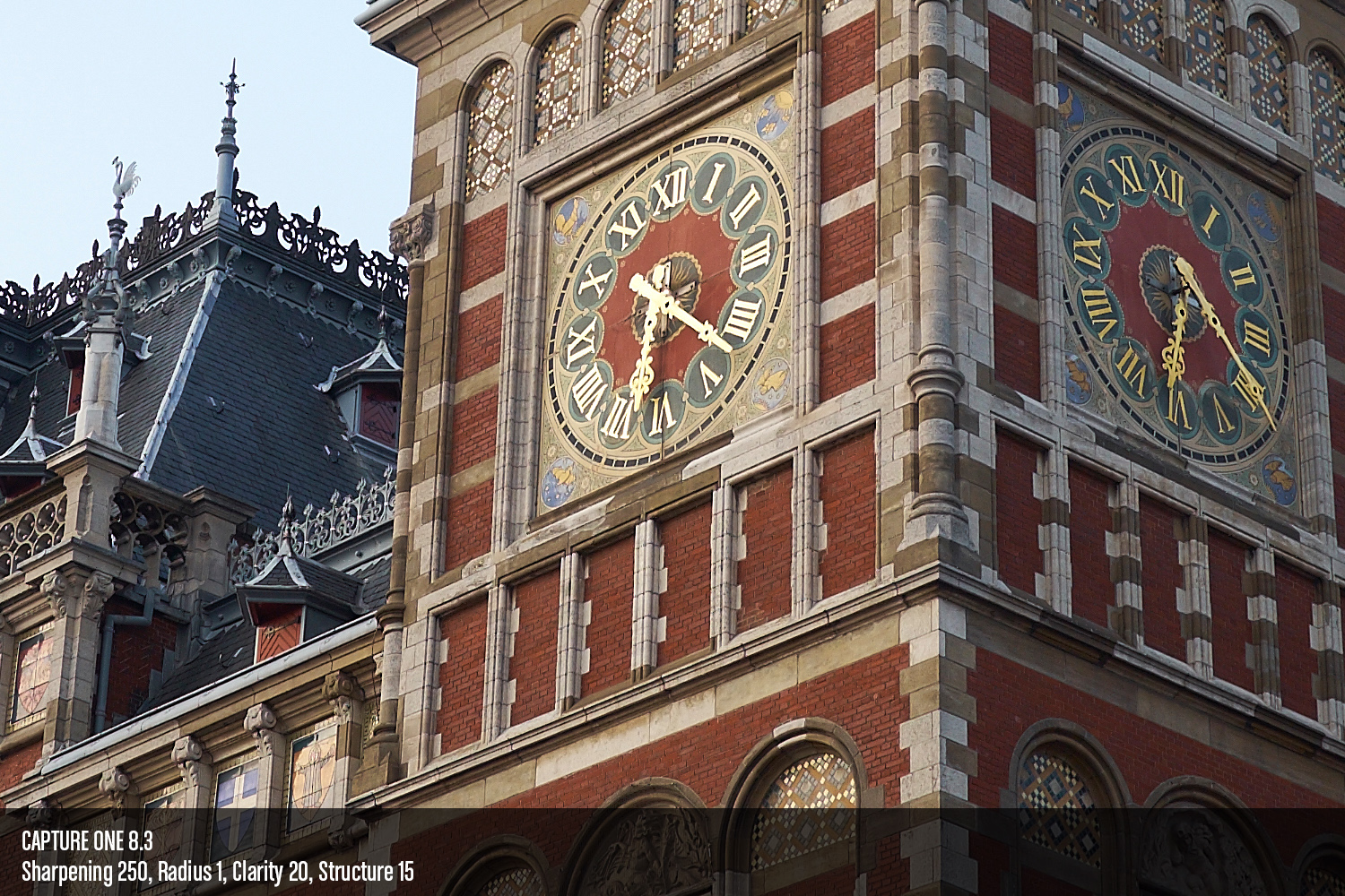
And finally, a quick comparison of Lightroom 6 and Capture One, both with equal amounts of Clarity applied,2 and what I felt was an appropriate amount of Dehaze and Structure respectively for this on-screen comparison, and without details getting too crunchy.
That challenging part about comparing Lightroom and Capture One is the companies that make the software have very different ideas about how sliders should scale. Adobe’s Amount slider goes from 0 - 150, whereas Capture One's go from 0 - 1,000. Yes, one thousand. In general, I find I’m able to get away with more aggressive sharpening in Capture One, depending on the kind of image it is. If I had inclination to get into selective sharpening, the inner areas of the building could be sharpened much more than those areas against the sky.
This is another reason I like Iridient Developer so much; its sharpening methods are more forgiving in that global sharpening can be pushed further before areas like in the top left where the building meets the sky gets riddled with sharpening halos.
Conclusion
In truth, I spent less than a minute optimizing the settings in Iridient Developer, and there are times when I still prefer the “old” Hybrid Sharpen method. This is still more than enough to keep me convinced that if you really want to get more detail out of your RAFs, spend your Lightroom upgrade money on an Iridient Developer licence instead. You’ll need to make some adjustments to your workflow, but that’s the tradeoff if image quality is paramount.
I intend to do a more comprehensive comparison of select RAW converters, but I’ve been holding off partly in anticipation of Lightroom 6 and Photo Ninja 2. It seems we still have some waiting to do on both fronts, so perhaps I’ll make do with what we have. For now though, when it comes to RAF editing, Lightroom will continue to be relegated to its Library features only.
- I also have yet to install the Creative Cloud upgrade for Photoshop, so as not to break ACR compatibility with the version of Lightroom I actually own (5.7). ↩
- This does not imply that 20 Clarity in Lightroom 6 is equal to 20 Clarity in Capture One. I also didn’t go so far as to change which method of Clarity was being applied in Capture One. I simply left it at the default, Natural. Likewise, Dehaze and Structure are definitely not equal.↩